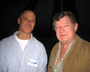
I got to hang out with Mr. Robert Hughes once. Here is a photo of us practicing irritable looks having a beer at an alternative art space in Westchester. Actually got on and I got to ask him about Andy Warhol to see if his view had softened at all. Mr. Hughes was famous for hating Warhol and he said "...yes in retrospect, Warhol was good and important." Mr. Hughes talked like Hemingway. He went on to say that it was the people around Andy that were so horrible and that ruined the experience for viewing his art. We had a nice time until I mentioned my German gallerest. "What the f***k is a galleriest?" Mr. Hughes asked. I explained that they called themselves that if they did not sell secondary market or dead guy art. A galleriest deals in living artists only. "Bullshit" Mr Hughes exclaimed crushing a Fosters can on his forehead with one hand.
By Benjamin Genocchio Here is a story about this famous critic by a real writer!
Published: August 7, 2012
For more than four years, I had the assignment to pre-write critic Robert Hughes’s obituary for the New York Times. I was a young critic at the newspaper, and coming from Australia seemed the right person for the assignment. I never wrote the piece.
Part of my reluctance to finish the assignment was perhaps understandable: By the time I was assigned to the obit Hughes had already cemented himself as the greatest art critic of our time. His popular history books had broadened his audience and made him a personality, as they say. He was a minor celebrity in his own right.
For a baby critic living in Australia, I grew up in awe of Hughes. He was a towering literary figure who it seemed to me was trapped in a minor genre. Looking back, he was the greatest prose stylist since Ruskin to write art criticism. He was also a near ubiquitous presence in publishing and on television, defining my views on art.
But Hughes influenced and changed me in other ways. He legitimized art criticism as something worthy, even valuable. He made it seem like it was the most important thing in the world. I wanted to be him; at the least, I wanted to write like him.
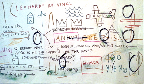
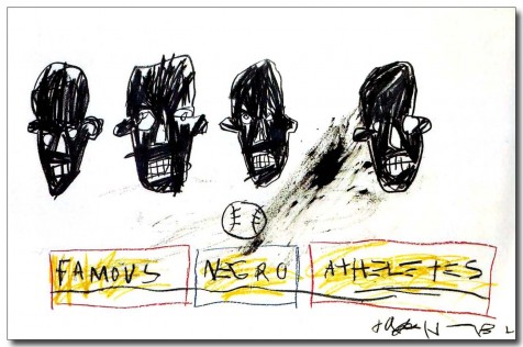
There is no imitating Hughes’s literary style, and believe me I tried. His combination of highbrow erudition and gritty vernacular gave his writing a distinctive tone along with his astonishing wit and flair. I’ll never forget the first time I read his description of the groupies that hung around Warhol’s factory as “social space debris.”
Part of Hughes’s fame derived from his ability to exploit television as a new vehicle for disseminating his ideas, most famously with the BBC series “Shock of the New,” which was seen by more than 25 million viewers worldwide when it first aired in 1980. Four decades later the book of the same name remains in print.
But another part of his legend derived from his platform, Time Magazine, the global weekly magazine which was to some extent the internet of its age — you could buy it and read Hughes anywhere in the world. He got to define art to a global audience in a way that no other critic has enjoyed before or since. Television only increased his reach.
Years later, meeting Hughes here in New York where eventually I also came to work, I was struck by his roughness of character, which is very Australian actually, and his astonishing erudition. He was very much like his writing, a mixture of high and low that appalled and excited in equal measure. He was coarse, crude, and yet brilliant.
I am not going to venture any views on his critical opinions of art and artists, most of which were shaped in the early 1960s and which, by the 1990s, increasingly seemed out of touch with developments in contemporary art. He found little to like, turning into a kind of reactionary crank. Eventually he gave up writing reviews altogether.
And yet reviewing his writing he also seems astonishingly prescient: He prophesied and decried the colonization of the art world by money and the celebration of empty celebrity. He was direct, even insulting in his views of those whom he disliked, making sport of “fraudulent” artists and “fawning” collectors and curators. All of which, however, made his writing an enjoyably compelling read.
I would see him occasionally at openings and at dinners, hobbling on his cane after a car accident in 1999 that nearly cost him his life. I pitied his physical decline, though he still commanded an audience. He had gravitas, and was very much aware of it. He was one of those people who upon entering a room everyone turned to admire.
I prefer to remember him, however, as more than this, as the kind of god of criticism that he was to a generation of young writers like myself. He could turn a phrase on a dime, he could paint and write poetry, he could speak Latin, Spanish, and Italian — he was a polymath in an age of imbeciles. He was, in short an intellectual warrior, fierce in his views, frequently combative, but ever passionate about the necessity of art.
Benjamin Genocchio, a former art critic for the New York Times, is editor in chief of artinfo.com.
by Benjamin GenocchioPublished: August 7, 2012For more than four years, I had the assignment to pre-write critic Robert Hughes’s obituary for the New York Times. I was a young critic at the newspaper, and coming from Australia seemed the right person for the assignment. I never wrote the piece.
Part of my reluctance to finish the assignment was perhaps understandable: By the time I was assigned to the obit Hughes had already cemented himself as the greatest art critic of our time. His popular history books had broadened his audience and made him a personality, as they say. He was a minor celebrity in his own right.
For a baby critic living in Australia, I grew up in awe of Hughes. He was a towering literary figure who it seemed to me was trapped in a minor genre. Looking back, he was the greatest prose stylist since Ruskin to write art criticism. He was also a near ubiquitous presence in publishing and on television, defining my views on art.
But Hughes influenced and changed me in other ways. He legitimized art criticism as something worthy, even valuable. He made it seem like it was the most important thing in the world. I wanted to be him; at the least, I wanted to write like him.
There is no imitating Hughes’s literary style, and believe me I tried. His combination of highbrow erudition and gritty vernacular gave his writing a distinctive tone along with his astonishing wit and flair. I’ll never forget the first time I read his description of the groupies that hung around Warhol’s factory as “social space debris.”
Part of Hughes’s fame derived from his ability to exploit television as a new vehicle for disseminating his ideas, most famously with the BBC series “Shock of the New,” which was seen by more than 25 million viewers worldwide when it first aired in 1980. Four decades later the book of the same name remains in print.
But another part of his legend derived from his platform, Time Magazine, the global weekly magazine which was to some extent the internet of its age — you could buy it and read Hughes anywhere in the world. He got to define art to a global audience in a way that no other critic has enjoyed before or since. Television only increased his reach.
Years later, meeting Hughes here in New York where eventually I also came to work, I was struck by his roughness of character, which is very Australian actually, and his astonishing erudition. He was very much like his writing, a mixture of high and low that appalled and excited in equal measure. He was coarse, crude, and yet brilliant.
I am not going to venture any views on his critical opinions of art and artists, most of which were shaped in the early 1960s and which, by the 1990s, increasingly seemed out of touch with developments in contemporary art. He found little to like, turning into a kind of reactionary crank. Eventually he gave up writing reviews altogether.
And yet reviewing his writing he also seems astonishingly prescient: He prophesied and decried the colonization of the art world by money and the celebration of empty celebrity. He was direct, even insulting in his views of those whom he disliked, making sport of “fraudulent” artists and “fawning” collectors and curators. All of which, however, made his writing an enjoyably compelling read.
I would see him occasionally at openings and at dinners, hobbling on his cane after a car accident in 1999 that nearly cost him his life. I pitied his physical decline, though he still commanded an audience. He had gravitas, and was very much aware of it. He was one of those people who upon entering a room everyone turned to admire.
I prefer to remember him, however, as more than this, as the kind of god of criticism that he was to a generation of young writers like myself. He could turn a phrase on a dime, he could paint and write poetry, he could speak Latin, Spanish, and Italian — he was a polymath in an age of imbeciles. He was, in short an intellectual warrior, fierce in his views, frequently combative, but ever passionate about the necessity of art.
Benjamin Genocchio, a former art critic for the New York Times, is editor in chief of artinfo.com.