Art

Basquiat & Kevin Durant in Brooklyn

The Angry Ironist

I noticed an unusually tall man bending down to scrutinize a drawing at the Basquiat show in the Brooklyn Museum. A mesomorph trailed him protectively. I soon realized this towering spectator was a famous basketball player, but I couldn’t place his name since I don’t follow sports. I took his picture anyway and approached his bodyguard and furtively asked who he was. The bodyguard made a face. “You don’t know?” he answered.

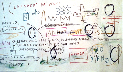
Untitled (Leonardo Da Vinci)  1982  Acrylic and oilstick on paper

An artist’s notebook is an incubator for work, a rehearsal space for ideas. ‘The Codex Arundel’ by Leonardo Da Vinci is the most famous example. Da Vinci’s name pops up in Jean-Michel Basquiat’s notebooks several times. Basquiat even has a drawing named after the Renaissance master. Whereas Da Vinci uses diagrams, sketches and texts for scientific inquiry, Basquiat uses them for irony. But Basquiat has different ambitions for his notebooks. He uses the pages from them as a background for his paintings. They form a platform where expressionistic painting acts as a counterpoint to the pseudo “scientific” content of the grid-like structures underneath. Interestingly, Basquiat uses sarcasm to point out the injustice of prejudice. Instead of a cool Duchampian indifference, irony sets the stage for a seething anger expressed with tortured faces. The only cure for post modernism is Romanticism and Basquiat delivers.

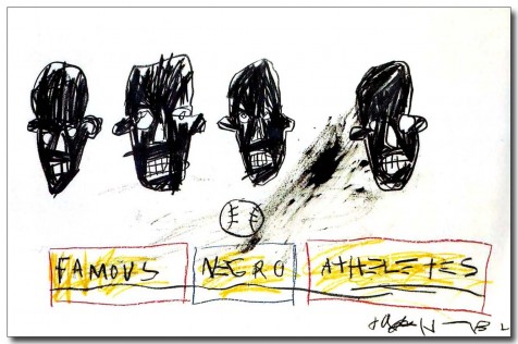
Famous Negro Athletes, 1981  Oilstick on paper

‘Famous Negro Athletes’ epitomizes Basquiat’s aesthetic. The athletes may be famous but from his drawings we can’t identify them – a racist observation that all black people look the same. The portraits have the emotional impact of a Giacometti. But instead of an existential visage of dread we’re confronted with bitter ‘portraits’ of people who suffer prejudice. Basquiat doesn’t use irony for smug cynicism, instead he uses it as an instrument for expression. How ironic it that? The torment of racism is best expressed when it is served up as a cold dish.This is what makes Basquiat rise above the rest of the artists of his generation. He eschews the bombastic, sentimental and faux suffering of his fellow 80s artists and their obsession with ‘bad’ painting. His vernacular is authentic. It is what he grew up with. It is graffiti. While the millionaire emotional fraudsters of his generation were painting ‘suffering’, Basquiat lived it.


I really wanted to know who that towering basketball player was at the show -- people were making such a big fuss about him. As soon as I got home I showed the photo I took of him to my son, a big basketball fan. “Wow! That’s Kevin Durant,” he exclaimed.

Thomas McManus is a writer, artist and professor at Fashion Institute of Technology in NYC.


Paul Rand, Art in Advertising

“Mail order advertisers, as we have said, have pictures down to a science.”  Claude Hopkins

As you enter the Paul Rand exhibition, you can’t miss a quote of his in a display case filled with his work. It proclaims, “There is no science in advertising.”

Advertising has always wanted to be scientific. Clients want to know where their dollars are going. They want a return on investment. They want ads that are “two-fisted”.  Within this den of Philistines, Paul Rand offers an alternative.  Instead of the huckster aesthetic of cold hard cash he tries to bring culture to the product. Paul Rand believes that art can be just as persuasive as science, if not more so.

Rand is an astute and eclectic salesman who embraces the art movements of the avant guard. If Matisse were a graphic designer, he would be Paul Rand.  A defining style incorporates the Mediterranean color, cut-outs and simplicity of the French master.


A pharmaceutical ad is an homage to Constructivism.


A book cover for “The Captive Mind” presages Op Art by a least a decade.


An ad for Westinghouse makes a deconstructionist statement.


Rand is the last modernist before the full weight of postmodernism eclipsed his generation’s optimism. His work is full of whimsy, not irony. It is a testament of how a lowly advertising art director can become one of the greatest artists of his time.

There is a saying that an ad in this morning’s newspaper is used to wrap fish in the afternoon. Sometimes it is also used to line the bottom of a bird cage. But every once in a while it ends up in an esteemed exhibition, like the one running now until October 13, at the Museum of the City of New York.


Thomas McManus is a writer, artist and professor at Fashion Institute of Technology in NYC.

Juxtapoz Opening Party

By Richard Osaka, Lift Trucks Special Report
Barnsdall Park,Los Angeles

I hunted for celebs, Molly, etc.  I was there for over an hour and walked throughout but only spotted Roger Daltrey from The Who.  Didn't want to take his pic.  Ed Ruscha was there but the only reason I know this is that I saw his picture with Robt. Williams. From the image's outdoor lighting I could tell that it was taken very early and maybe there was a preview before the opening.  I also saw a picture of Molly Barnes.  I definitely know what she looks like but I completely missed her.  Maybe I got there too late.


The Epicenter of Un-Expressionism: N 40'45' by W 73' 58'

"Content is a glimpse of something, an encounter like a flash. It's very tiny - very tiny, content."

- Willem de Kooning

We love going to MOMA. What we love best is visiting the lonely and neglected paintings. They seem to need company. Particularly, if one is a work of art that completely changed the art world.

Meanwhile, at the Rene Magritte show on the 5th floor, one had to stand in line for an hour. Nonsense!

We walked down a floor to the Duchamp corner to see “Three Standard Stoppages”.

And here it is. Isolated. Ignored. We can’t believe it was painted in 1914. One of our group dropped to their knees crying out, “We are not worthy.” Alarmed tourists on their way to the Margritte show looked over “Why are these guys slobbering all over this old subway map painting? Should we call a guard?"

We start up a conversation with the piece. On closer examination we realize that a version of a Fauvist painting  (Villon or Duchamp?)  “Young Girl and Man in Spring” was painted over. Maybe there is a cross in the painting also. The old work is turned on its side, scraped down. Defaced. Two black bands frame it as if in a shroud.

Over this tomb Duchamp drops the neutron bomb of modernity. A diagram (what appears to be a golf course) is painted on the surface. Let's take a closer look. There is a grid drawn over the painting in pencil. We think they were lines tracing strings randomly thrown tossed on the canvas.

What gives? What’s the subject matter? Is this a metaphor for something? Or is it just decoration? What is this guy trying to express?

All of these questions are irrelevant.

You see this is the first work of art where an artist tried to un-express himself. In other words, it was created solely by chance, a methodology that subverts the usual modus operandi of painting. “Three Standard Stoppages” is to painting what quantum mechanics is to classical physics.

It is born in an era when science realized that God does play with dice.

“Three Standard Stoppages” is Part 2 of a trilogy. It is sandwiched between “Three Large Stoppages” and the “Large Glass”. This middle child’s offspring were named Process, Conceptual, Minimal and Pop Art. This is the painting Jasper Johns doesn’t want you to know about.

We complained to the curator that MOMA shouldn’t show paintings that are still wet. She just looked at us.

Tom McManus is a writer and artist in NYC.

Purple Passion at Woodstock

By the time we got to Woodstock and walked into the Artists Association and Museum, we really needed a cup of coffee. My friend and art colleague Carl Van Brunt invited me to judge an exhibit at the legendary art space,  home to Philip Guston and George Bellows. Got a cup of mud across the street where we heard the most interesting story from Roger, one of the art guys associated with exhibit. 

Get this, he actually travelled on the Magic Bus with Ken Kesey and the Merry Pranksters! And as a kid while working at a job near Woodstock, the grooviest event in music history, he jumped the fence and got to see the whole show.  Very cool. This tale emerged as we waited 15 at the coffee shop take out counter. Hey you, where's our order?  "Ooops, I forgot"   said the beaming young lady, apparently distracted while taking photos of some fascinating item stuck on the restaurant wall.

The space was a cacophony of paintings, resting on tables and leaning against walls in the four rooms. Over 90 to be sifted down to a manageable number of 35 or so.  The nice thing was that as an out of towner, I did not recognize anyone. The kindly staff just laughed when asked " Is there anyone we should toss as they may be a great artist but just a total dick?"  Alas, no c-note bribes discretely taped on the stretchers for the esteemed judge. 

A wide range of pieces:  two works by separate artists combined to make a story about a kid fishing startled by a nude woman posing in a forest photo, a tiny realistic painting of clouds coupled with the same billowy cloud forms painted in wild abstracts. A painting of two realistic eggs next to the same shapes blown up in a huge black & white Franz Kline like gestural oil. A theme emerged about realism moving one step further. 

Another piece employed Purple Passion soda cans, maybe the first time ever?  A surprising amount of soft and extremely well put together abstracts.  Some very strong from-the-gut type abstracts, the kind you don't see anymore. The kind we don't think artists could paint anymore. But then we have all been overwhelmed by the relentless art reviews of the usual art superstars in Chelsea galleries. 

The point that really comes across is that these artists are all delightfully enjoying the process of painting. "The opposite of Jeff Koons." Carl Van Brunt proffered. And he is right. All that creatively bankrupt art-made-by-art-assistants junk really is the antithesis of art. Hire someone else to do the art piece? Why bother to do it at all? That's what hits like a lighting bolt. These artists love what they are doing. It means something. And since most are not in big commercial galleries, you can bet that their dealers are not telling them what to paint.

So pull the canvas tarp off the VW micro bus, take the trip up the road and see the show. Feel again the glorious, true and righteous power of painting. This is why we like art. And the area is super groovy. I will bet you a cup of joe you come home not only with a real estate brochure but tuned in, turned on, and ready to go make some art. 

Phillip Guston (1913 - 1980). My Coffee Cup, 1973. Oil on hardboard. WAAM Permanent Collection, Gift of Mr. and Mrs. Karl E. Fortess. Photo of Carl Van Brunt. 

The show runs through August 18. The Gallery is open 12 - 5 Sunday, Monday, Thursday and 12-6 Friday and Saturday (closed Tuesday and Wednesday). 


http://www.woodstockart.org/

Interviews on Art Marketing (Part III)

Maria Anna Alp (Left), Alex Guofeng (Middle), and Paul Grosse (Right)

Our third interviewee in this series on art marketing is Paul Grosse, the director of ALP Galleries (alp-galleries.com)

(Mackey) We are interested in your feelings concerning the balance between art and art marketing. For example, there are artists like Takeshi Murakami and Jeff Koons where marketing and manufacturing play a large part in their careers. And there are artists who follow the Van Gogh model who do nothing but focus on art at the expense of their careers. There seems to be a fine line that is constantly shifting between maintaining an artistic reputation and being known as a sellout.


Interviews on Art Marketing (Part II)

(One of Rick Osaka’s recent works)


What does it mean to have an artistic reputation? Is there a line between being a sellout and a savvy businessman? To further investigate this issue, I relied on the help of professionals. A survey was sent out with a list of eight questions to experienced art professionals that would bring insight to the modern role of marketing in art. These people have years of real-world experience dealing with the modern art world and all the business aspects of it. The responses I got ranged from successful art dealers, consultants, artists, curators, and more. Of course there was no one definite answer, as the answers where as varied as these people’s backgrounds. However, there was a general consensus on some issues, and all the responses added valuable and smart insight to the subject.

Interviews on Art Marketing

ltprojecct.jpg

What does it mean to have an artistic reputation? Is there a line between being a sellout and a savy businessman? To further investigate this issue, I relied on the help of professionals. A survey was sent out with a list of eight questions to experienced art professionals that would bring insight to the modern role of marketing in art. These people have years of real-world experience dealing with the modern art world and all the business aspects of it. The responses I got ranged from successful art dealers, consultants, artists, curators, and more. Of course there was no one definite answer, as the answers where as varied as these people’s backgrounds. However, there was a general consensus on some issues, and all the responses added valuable and smart insight to the subject.

Vote ‘yer Wallet, Matey!

We put Michael Mapes card right up there when the gift kiosk guy wasn’t looking. At the end of the elevators in MoMA. There, but for one brief shining moment with all the greats; De Kooning, Pollock and Picasso. And some lady who was perusing the rack, selected it. Right in front of us. I shit you not. See documentation of this in only slightly enhanced actual photos. She handed it to the cashier and was willing to pay $1.21 but the kiosk dude said ” This is not one of ours. You may have it”. She just beamed and stuffed it and the Warhol card in her purse. That’s got to be a boost!

So attention all artists! Get your exhibition cards and put them on the rack by the elevators at MoMA and see what happens. See if your work holds up. See if it gets selected over the old dead artist guys post cards.

Aye, democracy votes with it’s wallet. No truer said. Send your photos to us and we will post. What’s the worst that could happen? ” What are you in for? Non-sanctioned postcard rack placement.” Please. This would be a very fun Post headline and would get you even more desired publicity.

We like Mr. Mapes work also. Mr. Mapes work is stunning. He makes faces in boxes that seem to shimmer and move as look at them. Made up of tiny circles of color stuck on with insect display type pins in foamcore in a wood box. Some colors and details are inside little empty pill capsules but all this still registers really well as a realistic person in 3d as the deep areas like eye sockets are further back and something like a nose is further out. His postcard is for a show opening Saturday February 5th at the Parlor Gallery in Asbury Park.

FA-Q

The Rivington school, despite it’s expensive sounding name (it reminds me of a boarding school parents spend a fortune on to straighten out their “troubled” child), is not a typical school, in fact it’s not even educational. Granted, most art schools aren’t typical (or educational), but throw out the notions of RISD or Pace and instead think cheap booze and NYC clubs. As the artist FA-Q aptly stated, it was “a bunch of nuckleheads (sic) and wannabees” where “society’s outcasts would show up” (at least this guy is honest). The Rivington school started as an offshoot of the latino social club “No Se No”. It was a bar that had an open performance, everything from visual art, to singing, to hanging up a work on the walls. I know, I know, most open performance things are a complete joke (let me give you a hint not to attend any comedy open-mike nite anywhere). However from this movement stemmed some very famous and talented people, including Kevin Wendell (aka F-AQ), Ray Kelly, Taylor Mead, Phoebe Legere, and countless others.